

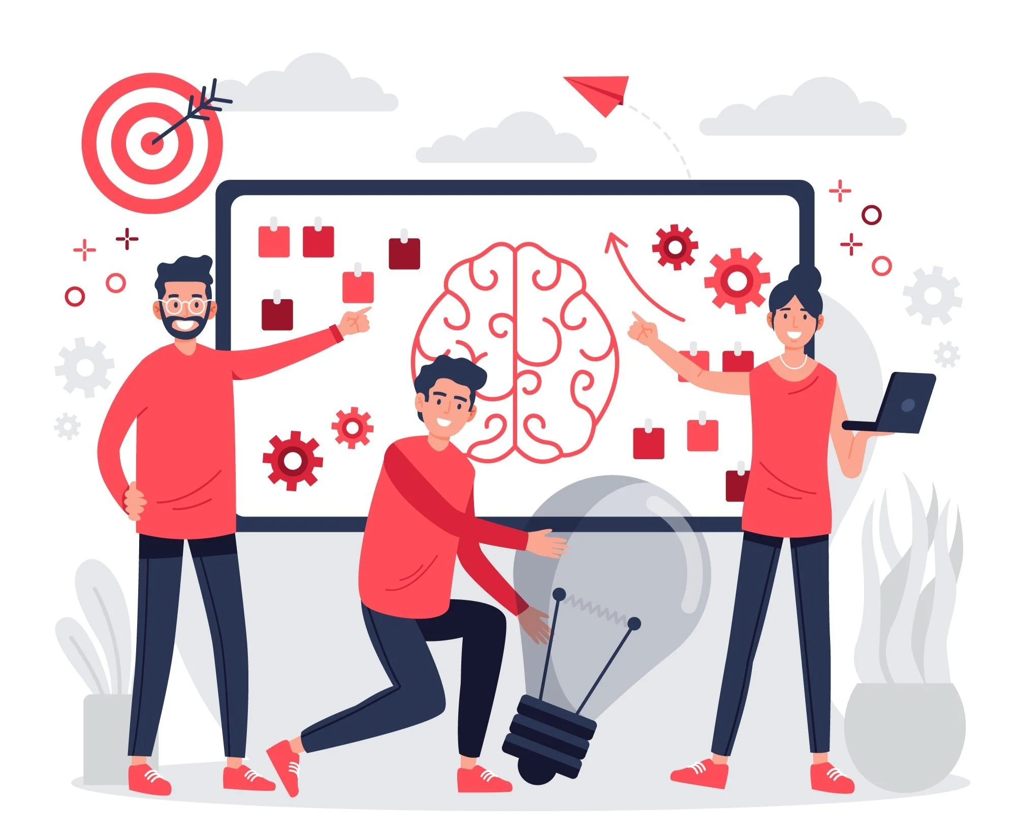
My Design Process:

The Problem:
These days, most of us are balancing packed schedules, limited energy, and high expectations.
When it comes to planning an event, the pressure to make it look picture-perfect — all while sending invites, keeping track of guests, coordinating details, and staying in touch with everyone — can get overwhelming fast.
A lot of planners end up using a messy mix of tools like spreadsheets, group chats, social media, and RSVP sites, but none of them really work smoothly together.

The Solution:
Event Vibes was created to ease that burden — offering a streamlined, all-in-one solution to simplify planning and bring the joy back to hosting.
A place where planners and coordinators can manage, get inspired, stay organized, collaborate and stay stress-free in a fun and upbeat online environment.

Competitive Analysis:
Discover

I spoke with 6 people over Zoom and Vowel — listening closely as they described the stress, confusion, and chaos that often comes with planning events on their own.

“The most frustrating part of planning
an event is communication”
Through a Google search I chose 4 different apps and websites that claimed to be Event Planning/Management
sites to get a better understanding of what was already out there for users.
I was actually quite surprised there were not more “All in One” resources out there.


User Interviews:

“You need a tool that will help you keep yourself organized, whether it be a calendar or a planner. “

From there a few “How Might We” questions were created in order to reframe user pain points into design opportunities.

I was able to develop two personas based on key findings and pain points that were frequently brought up to establish a few common “problems” and identify priorities for my site moving forward.

After going through my interview transcripts I created an Affinity map for the first time to layout all the little details and things said throughout that I could organize and discover what commonalities there were in order to create the “Ideal user” or Personas.

User Persona # 1 & 2

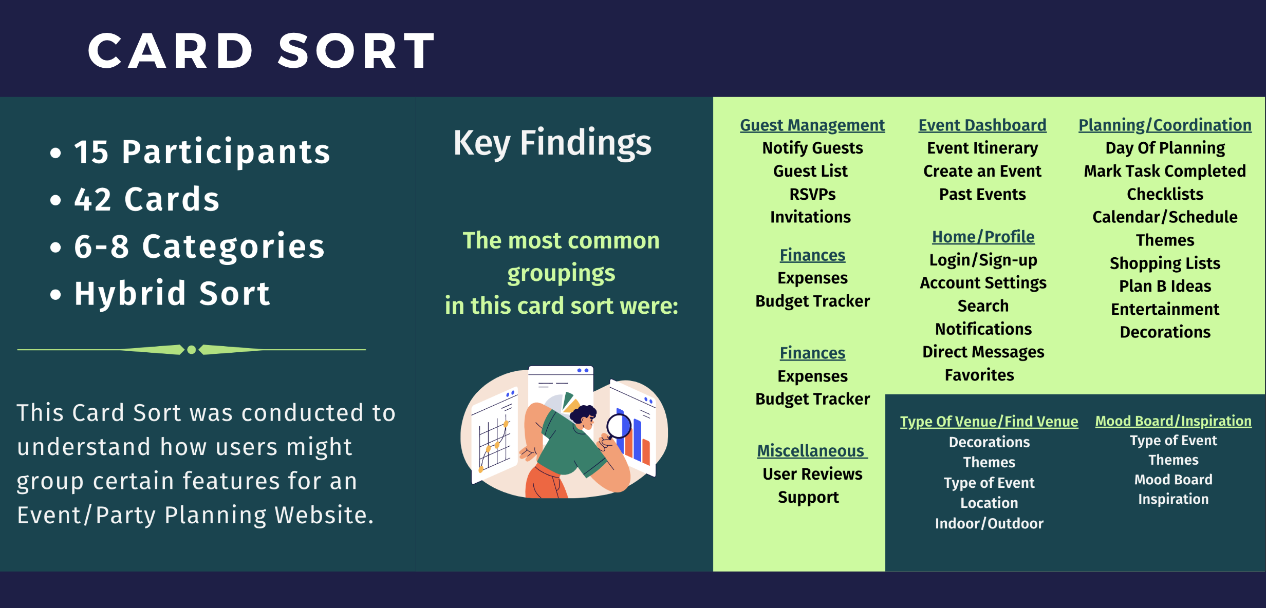
To make sure the sites structure made sense to users, I ran a hybrid card sort on Optimal Sort where I asked people to group features like “RSVPs, Expenses, Checklists, Support, etc.”

Next, I mapped out task flows to focus on core actions for this site.
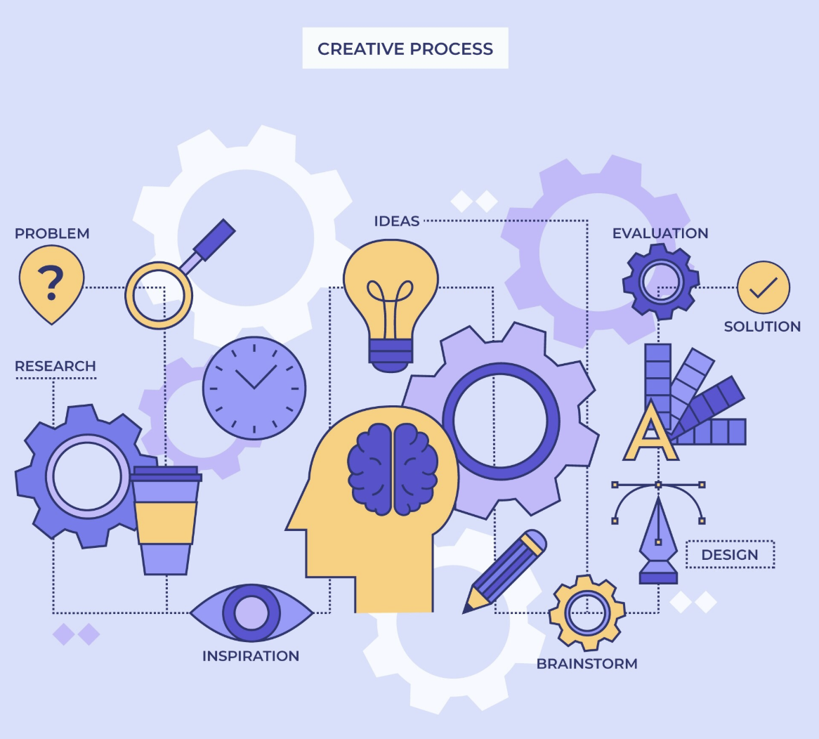
Ideate
Once I had a clear picture of who I was designing for, I started thinking about creating my Sitemap to layout the main parts of the site.
I ran with the idea that planning shouldn’t feel like a chore. It should be fast, flexible and chill.
I wanted to include features like “Group Polls” and “Group Chats”to make it fun and be able to include your friends while also brainstorming ideas for event details.

Design

Low-Fidelity Wireframes

With my task flows mapped out, I moved into sketching low-fidelity wireframes.
At this stage it was all about structure and layout - no visuals, just figuring out how screens would connect and what actions need to be planned out.
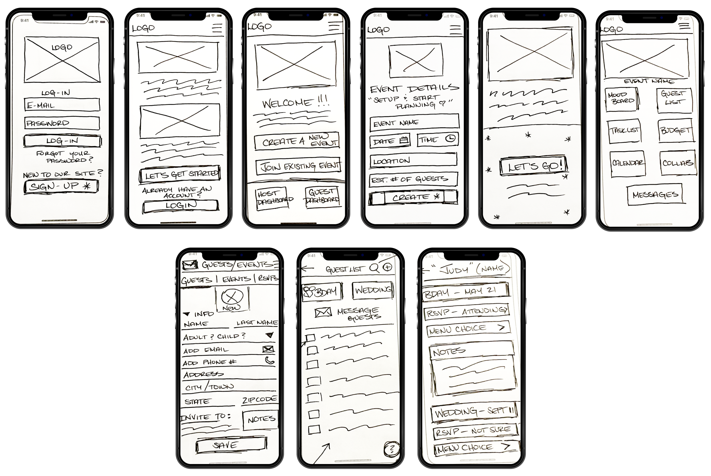
Using some blank iPhone templates I printed out I sketched out a few LoFi Wireframes based on my thoughts, card sort, sitemap and task flows.
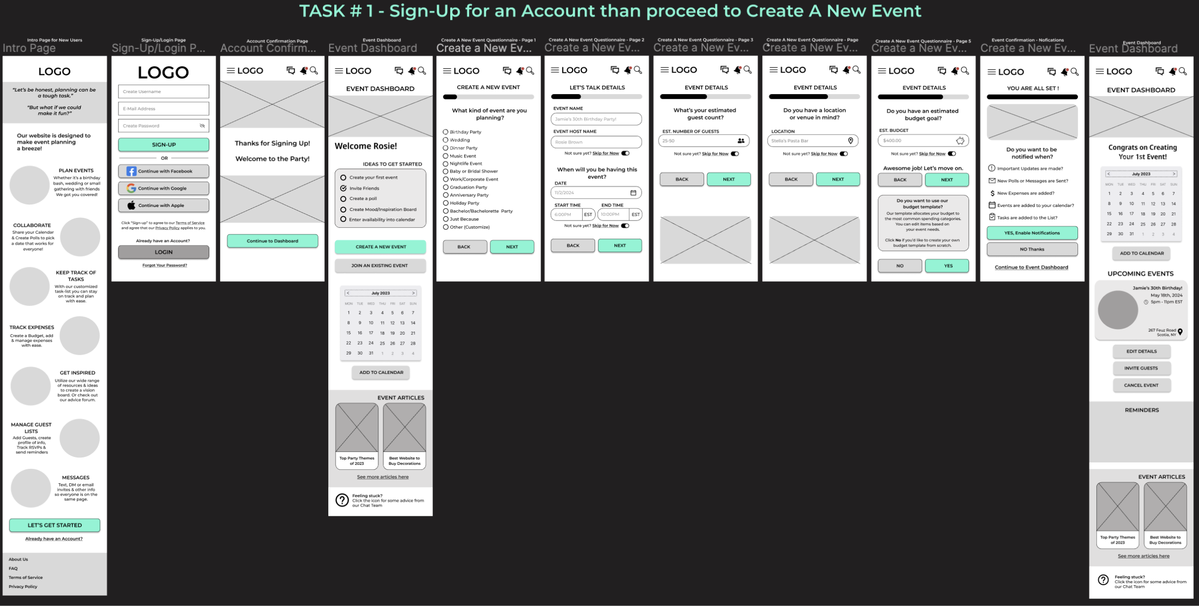
High Fidelity Wireframes
I started digitizing wireframes and creating “Mid-Fidelity Wireframes” on Figma.
I started adding some colors and different fonts to start envisioning the design better. During this time I started learning about grid layouts. This played a pivotal role in determining the placement of elements.
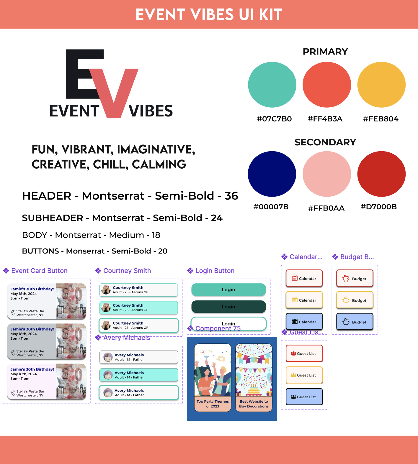
Next, I created a mood board to lock in the visual vibe of the site. Fun, creative, positive, and supportive.
I researched colors and their meanings, fonts and logo ideas that felt fresh and user friendly while I was still learning the psychology behind choosing different design elements. I drew inspiration from Pinterest, Dribble and other event related apps/websites on the internet.
I also did NOT have a name for my site at the time. I ended up utilizing Chat GBT during its beginner stages for name ideas. I narrowed them down to EventEase and EventVibes, eventually choosing EventVibes.

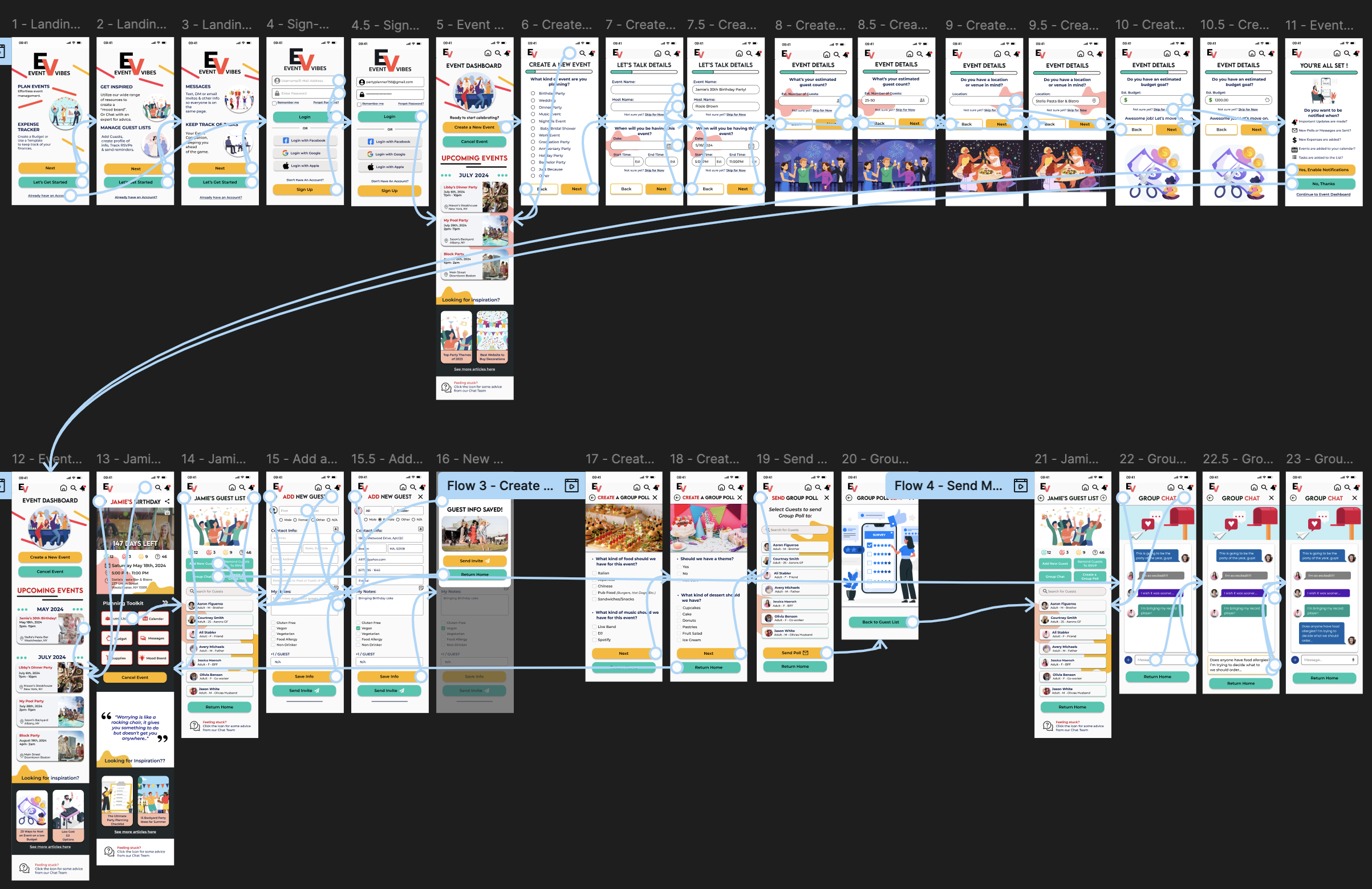
Prototyping
The next step was creating 4 task flows for testers to complete when using my interactive prototype.
Task #1 - Sign-In to an Existing Account & Create a New Event.
Task #2 - Add a New Guest to the Guest List
Task #3 - Create a Group Poll & send to Guest List
Task #4 - Send a message in the Group chat,

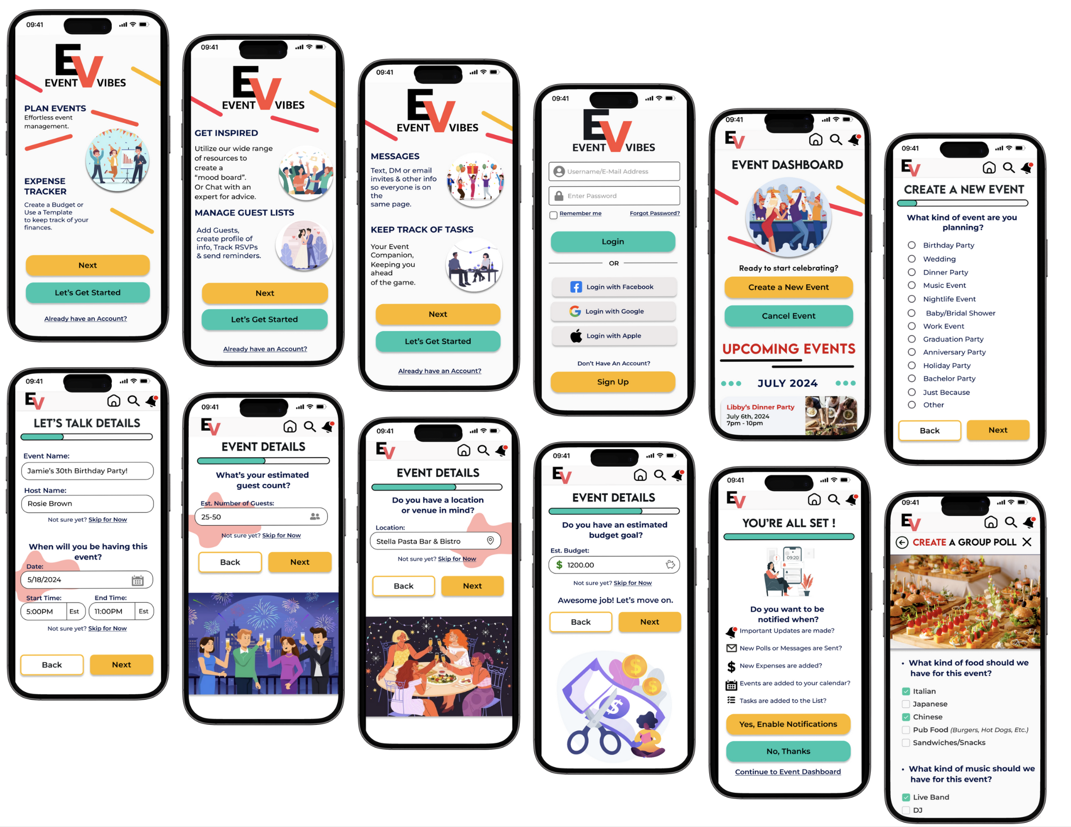
With the style guide in place, I brought my screens to life with high-fidelity wireframes. This is where everything started to click - Layout, colors, interactions and fonts all came together.
Testing

My usability testing was a success!
Every participant gave plenty of feedback in order for me to successfully iterate for a new and improved site.
Every user said they really enjoyed the “Fun” looking User Interface and the options that it gives.
Comments were made about how creative the “Message Users” feature was and the ability to keep different guest lists separate.
Aside from having “too many” similar buttons/CTAs the site was very “User Friendly” according to my testers.


Key Takeaways
As I wrap up this project, I'd like to take a moment to reflect on what I've learned.
This was my first experience with a complete User Experience project, and it taught me a lot.
Some of the best ideas came from unexpected user comments/feedback.
Originally there was a lot happening on every screen, but I think I have simplified things
a lot more after learning so much more in my UX Program.I would definitely spend time with a few more initial user interviews to gather more insight on
what’s important to users when it comes to a solo website that stores all your info in one place.I would also do more usability testing of the final prototype.
Final Thoughts
Designing Event Vibes was all about finding the balance between structure and spontaneity - creating a tool that helps people plan events without overthinking it.
Through each step - From user research & task flows to wireframes & usability testing - I made sure to iterate based on real feedback to keep the experience “User First.”
Small changes made a big impact in helping the site feel more intuitive and less cluttered.
The final design is a clean, playful, and flexible platform that makes it easier for users to bring their plans to life - whether it’s a last minute hangout or a full on celebration.
