
NexGig Case Study

End to End Mobile App
From discovering gigs to building skills & managing clients.
“NexGig turns potential into progress.”
Power your hustle with “NexGig”
Role: UX/UI Designer
End to End Design Process, Research, Task & User flow creation, Wire-framing, User Interface Design, Prototyping, Usability Testing

Tools Used:
Timeline: February - May 2025
Project Overview:
NexGig is an all-in-one freelance and gig work platform that helps users find flexible income opportunities based on their skills & interests.
This case study outlines my end-to-end UX design process, focusing on understanding user needs, defining core features, and crafting a bold, futuristic interface reflects the brands mission: to power the next generation of independent workers.

The Problem:
When I first set out to design NexGig, I imagined a world where freelancers, gig workers and side hustlers didn’t have to chase opportunities - they could attract them.
As someone who has navigated the unpredictable world of independent work, I understood the frustration of juggling multiple platforms, unclear job expectations and limited support,
The Solution:
NexGig was created from that experience.
A bold, tech-forward platform built to simplify the hustle and help people take control of their careers. Its a space where talent meets opportunity, where users can discover gigs, sharpen their skills, and grow their networks with confidence,
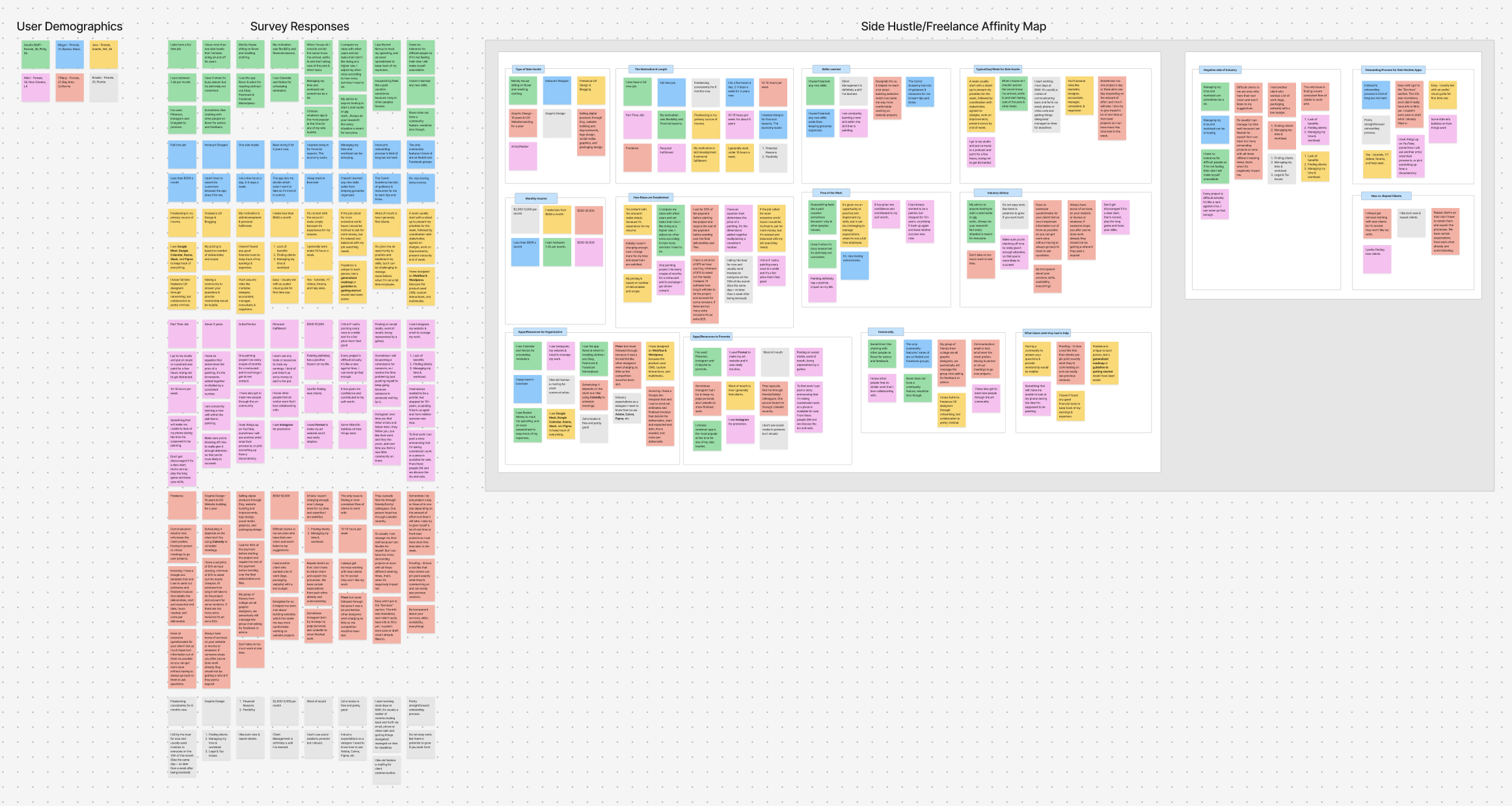
Research:
My first step in the research stage of this project was to interview other participants that also have experience in this field.
Unfortunately for me I had limited access to users that had time or wanted to let me interview them for this project.
I ended up creating a detailed survey based on my user interview questions and over time gained traction and was able to gain valuable insights from different freelancers, gig workers and aspiring side hustlers.
From this research, I created an Affinity Map in FigJam and uncovered key themes.


* What type of side hustle do/did you currently do?
Graphic design, freelance services, UX Blogging, website building, logo design, social media graphics, and packaging design.

Satisfaction based on consistency of income: Some are satisfied when the work is consistent, such as during busy seasons, while others are dissatisfied due to inconsistent work flow and a desire for a more stable income stream.
Satisfaction based on perceived value and fair pricing: Several feel satisfied when they believe they are being paid a fair price for their time and expertise, particularly once they adjust their rates to match the work involved.
Dissatisfaction with earning potential: There is a desire for higher income potential and more clients to reach desired earning goals.

While awaiting survey results, I put together a competitive analysis to compare similar platforms. I examined features, user flows, and pain points across sites and apps. This helped me identify both common UX patterns and areas where NexGig could stand out.

New freelancers want guidance and clarity, not just listings.
Many juggle multiple platforms and want one place to manage everything.
Trust and community are crucial in freelance success.
Survey Key Insights:


* What motivated you to start your side hustle or gig work?


Word of mouth is a common way people find clients or opportunities.
Platform or app-based work sourcing is utilized, like Rover or general platforms.
Social media and online presence such as posting on social media, Facebook groups, marketplaces, eBay, Poshmark, and being represented by a gallery.
Direct inquiries from seeing someone's work is a method as well as networking.
Personas:
From the insights and other information I was able to summarize and create a few user personas to better explain the type of user that needs this new product.


Site Map:
After spending some time brainstorming the overall structure of my end-to-end app, I started creating a sitemap to outline the key features and components I wanted to include.

Task Flows:
I mapped out key task flows for -
1) Sign-up and complete “onboarding process”.
2) Sign-up for a skills class in the “Learning Hub”.
3) Go to Edit Profile and take a Skills/Interest Assessment Test.


These flows helped me clarify the most intuitive, smooth, and goal oriented.
Low-Fidelity Wireframes:
Based on everything I’ve learned so far, I sketched out some low-fidelity wireframes to shape the foundation of my platform. My focus was on keeping things clean, easy to follow, and action driven, with bold buttons and simple navigation that matched NexGigs modern, no fluff personality.
After sketching I started implementing them into Figma to get some framework going in order to start putting this project to life.


High-Fidelity Wireframes:
As I moved into high-fidelity screens, I brought in NexGigs branding: deep blues and teals, soft whites, pinks and oranges for contrast. I spent a good amount of time studying different forms of color theory and what every color represents. The colors I chose represents energy, empowerment, calm and futuristic confidence.
The logo I created took me a bit of time as well as logos aren’t my strongest design trait. I utilized some help from one of my favorite design programs…Canva. The end result was a simple yet bold logo.


Version 1:


Usability Testing:
Once the wireframes were in a good place, I continued on with creating an interactive prototype in Figma.
This helped me visualize how users would actually move through the platform.
Clicking through screens, testing pages, exploring skill classes, etc.
While I wasn’t able to complete one on one testing, I shared the prototype in a usability test via Maze to gather feedback from users who had previously taken my quiz, along with a few other fresh faces.

Their input helped me catch a few usability snags - like unclear CTAs and slightly confusing steps regarding the skills and interest test. I was able to refine the flow to make NexGig smoother and more intuitive. The feedback I received gave me insights I needed to validate core interactions and make sure NexGig felt like a tool freelancers could actually see themselves using.
Usability Feedback & Iterations:

Feedback:
“Some of the pages seemed a bit busy and overwhelming.
During the sign-up, it would be nice to be able to skip some questions, or save some for later in order to explore more of the app first.”
The onboarding - I felt like there were some screen that were not needed in the onboarding usually when i open a new app I know generally what it is and just expect a create an account page (sign up with google, apple or email).”


Actions such as 'return to home' were given a bright red color, which feels primary, whereas the path I should take was a dull red, which feels secondary.”
“I think the app was easy to follow overall!“


“Signing up for the class seemed to take an extra step.
I expected to get to Learning Hub after clicking on the link, but it out me in another page where I still needed to click Learning Hub to them find the class.”
“I really really like it overall! “
Color and style is awesome, you thought through so many details on the signup process and I think you're blending a lot of elements in a really refreshing way! “
Thoughts/Revisions:
The most common complaint was too many screens for Task 1 Onboarding. I need to simplify it a bit.
I’m also going to fix the “CTA” button colors because a user brought up a good point that the red button should be a primary color and coral being the secondary. Or more specifically making the “Learning Hub” button stand out more.
I plan on fixing the prototyping buttons for the footer because it seemed like a number of users weren’t able to click on them properly.

Iterations:


Final Screens:
Task 1 - Onboarding / Create Profile:

Task 2 - Take Skills/Interest Test:

Task 3 - Go to Learning Center & Sign-Up for Skills Class.

Final Thoughts:
Building NexGig was a real deep dive into what freelancers and gig workers actually need-not just to find work, but to manage and grow it all in one place. From user research to wireframes and testing, this project taught me how to stay flexible, listen closely to feedback, and design with real people in mind.
It wasn’t always smooth sailing, but each challenge pushed me to think smarter and design better.
In the end, NexGig became more than just a platform-it turned into a tool that supports freelancers where they are and helps them get where they want to go.
There’s still more room to grow, but I’m proud of how far this concept has come-and I’m excited to keep building from here.
